Camile Thai
Brand Strategy | Brand Refresh | Brand Roll-out

Good Mood Thai Food
Brennan & Stevens handled the complete brand refresh for Camile Thai. We were asked to design a system that reflected Camile’s current offering and that had the flexibility and strength to grow alongside the business, as it continued to expand across Ireland, the UK and the US.

Complete brand refresh for Camile, a guilt-free Thai takeaway leading the way in sustainability and health-based menus.

Guilt-free takeaway Camile is a trailblazer in sustainability—the first Irish chain to use compostable packaging, potentially taking millions of disposable packages out of landfills each year. They also cook with locally-grown, grass-fed Irish beef and pork, as well as local vegetables and herbs when in season. And they use water-regulating woks to average less than 1% food waste.

As a company, there is no question that Camile are leading the way in Irish hospitality and the takeaway industry. But prior to their brand refresh the Camile branding wasn’t reflecting their significant growth or their future goals. We found that some of Camile’s best traits and USPs were entirely missing from their branding.

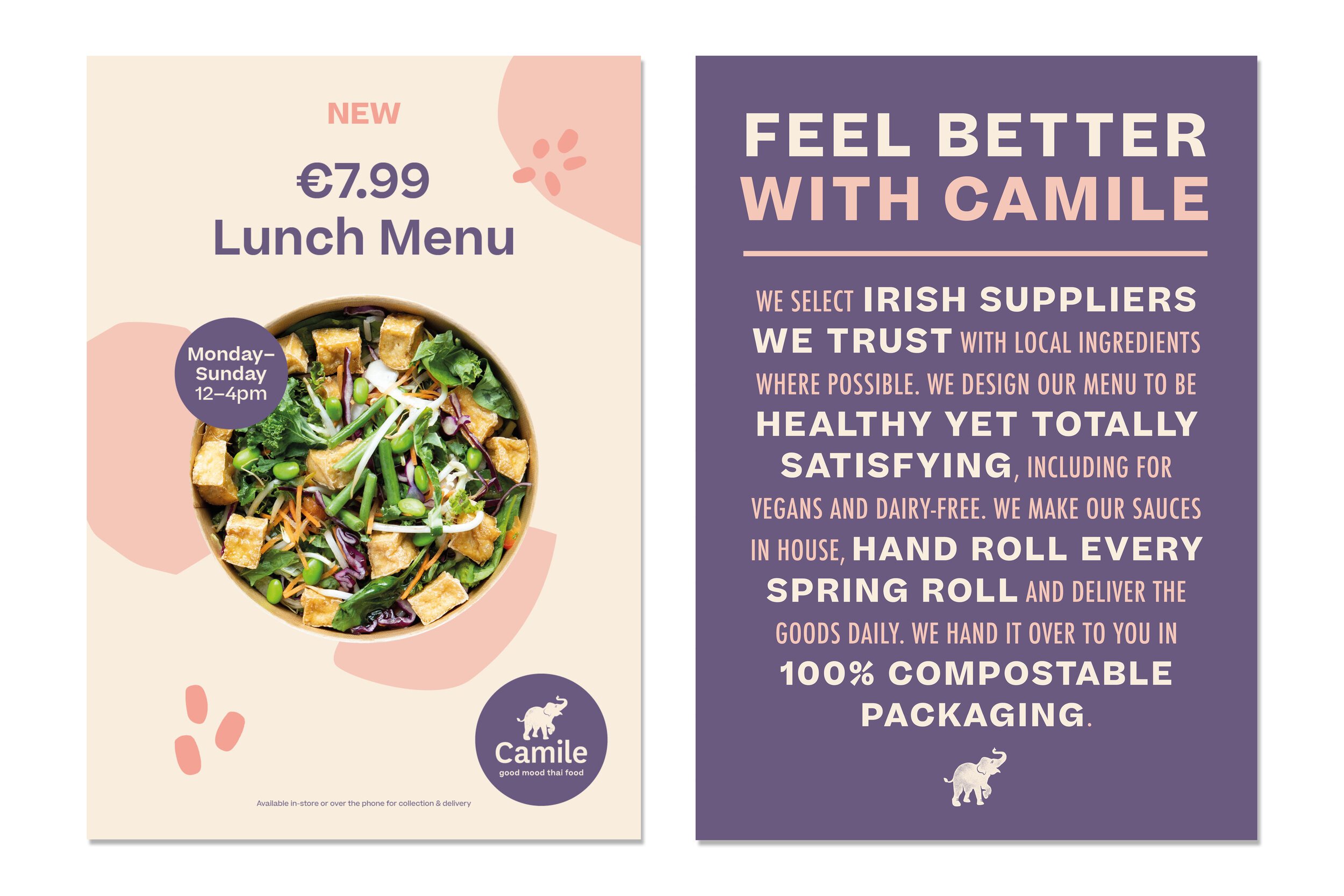
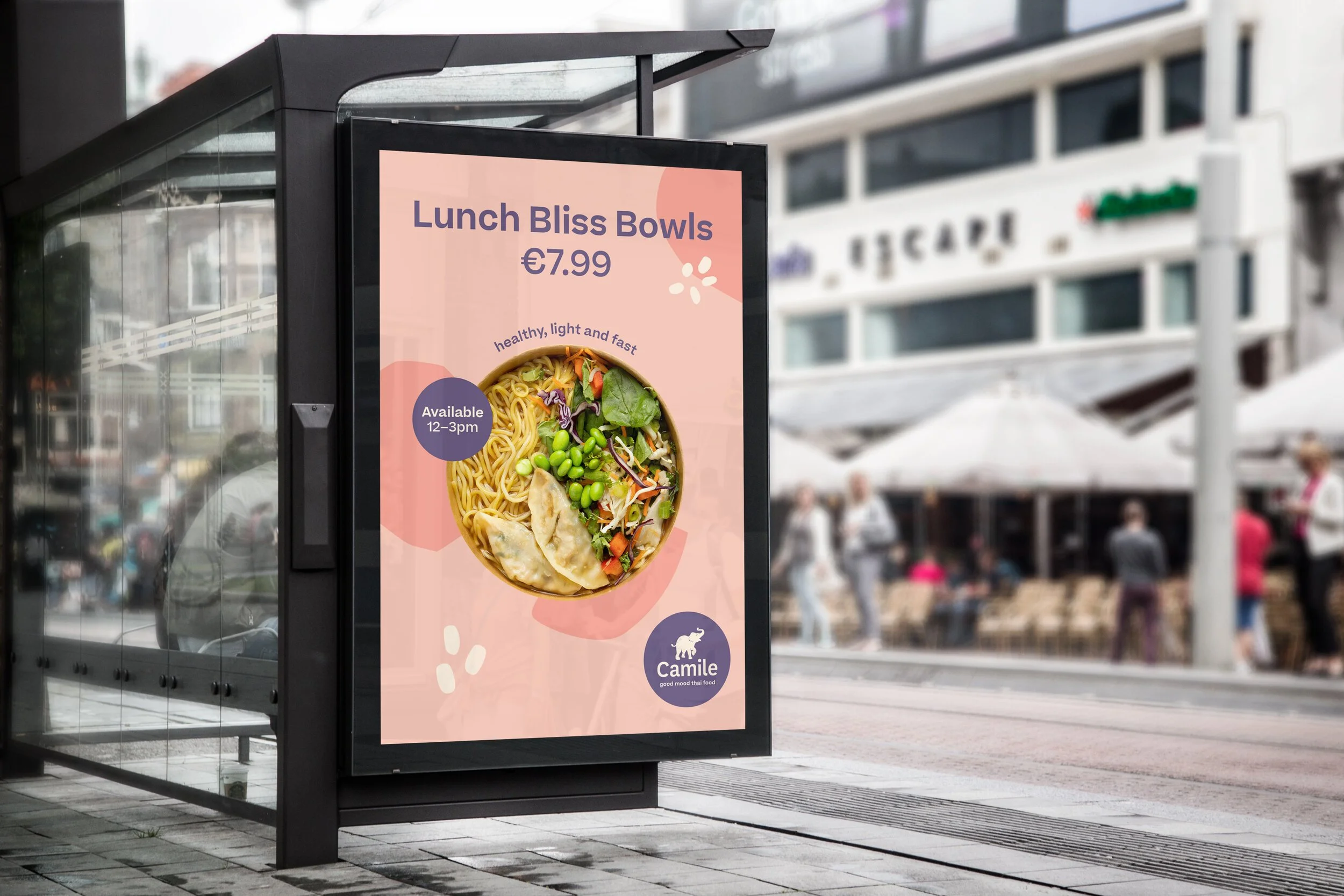
It was our job to demonstrate Camile’s forward-thinking and purpose-driven ethos through design. Every touchpoint was considered and designed; from the customised logotype and logo mark, the colour palette, brand typeface and imagery to the full range of food packaging and marketing materials.

We wanted to bring warmth, fun and sophistication to the brand elements, as well as a boldness and energy that we felt from all aspects of the Camile company.

We developed a warm colour palette, bold, fresh patterns and energetic copy to match the brand’s friendly tone of voice and future-facing mission.

The logo type was redesigned and customised to represent their bold but trusted brand. For the logo mark we were mindful of the fact that Camile’s elephant motif had become synonymous with the brand over the past 10 years. So, the elephant motif remained but took on a more youthful, playful form.

The result is a visual language that better connects with Camile’s conscious, optimistic target audience and reflects the innovative essence of the brand.


